Components
Demo Time includes several visual components to enhance your presentations.
Arrow
The dt-arrow component draws an arrow with customizable properties:
<dt-arrow x1="0" y1="100" x2="480" y2="100" line-color="#15181f" line-width="2" arrow-head="both"></dt-arrow>
Properties
x1andy1: Coordinates for the starting point.x2andy2: Coordinates for the ending point or dimensions.line-color: Color of the line or border.line-width: Thickness of the line or border.arrow-head: Type of arrow head to use.end: Arrow head at the end (default)start: Arrow head at the startboth: Arrow heads at both ends
Rectangle
The dt-rectangle component draws a rectangle with customizable properties:
<dt-rectangle x1="25" y1="30" x2="375" y2="75" line-color="var(--vscode-editorError-foreground)" line-width="2" fill-color="transparent"></dt-rectangle>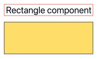
Properties
x1andy1: Coordinates for the starting point.x2andy2: Coordinates for the ending point or dimensions.line-color: Color of the line or border.line-width: Thickness of the line or border.fill-color: Fill color for the shape (usetransparentfor no fill).
Circle
The dt-circle component draws a circle with customizable properties:
<dt-circle x1="25" y1="25" x2="125" y2="85" line-color="#ffd43b" line-width="4" fill-color="transparent"></dt-circle>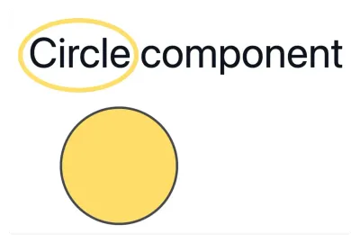
Properties
x1andy1: Coordinates for the starting point.x2andy2: Coordinates for the ending point or dimensions.line-color: Color of the line or border.line-width: Thickness of the line or border.fill-color: Fill color for the shape (usetransparentfor no fill).
List
The dt-list component allows you to progressively reveal list items one by one with each click during your presentation. This makes it easier to present step-by-step lists without manually wrapping each item in a dt-show component.
Usage
You can use either Markdown or HTML list syntax inside the dt-list component. Each list item will appear one by one as you advance through your slide:
<dt-list>- First step - appears on first click- Second step - appears on second click- Third step - appears on third click- Final step - appears on fourth click</dt-list><dt-list type="ol"> <li>First step - appears on first click</li> <li>Second step - appears on second click</li> <li>Third step - appears on third click</li> <li>Final step - appears on fourth click</li></dt-list>Properties
type(optional): Set toolfor an ordered (numbered) list. Defaults to unordered list if omitted.
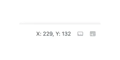
Finding the right coordinates
When you open the slide in the preview mode, you can click on the ruler action to see the coordinates of the mouse pointer. This will help you find the right coordinates for your components.