
Pixels theme
The pixels theme is a retro pixelated/8-bit gaming theme featuring dark backgrounds, cyan borders, and a pixel-art aesthetic inspired by classic arcade games and retro computer terminals.
Features
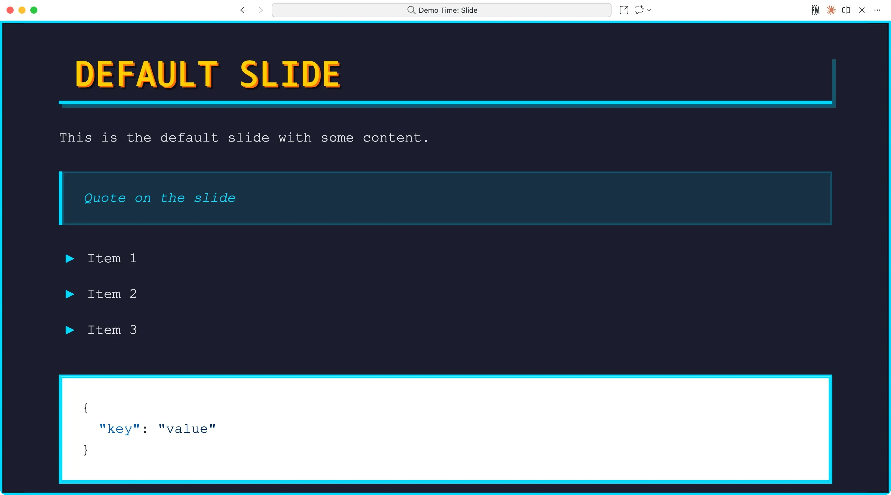
- Retro 8-bit Design: Pixelated borders, text shadows, and classic gaming aesthetics
- High Contrast Colors: Cyan (
#00d9ff), yellow (#ffcc00), and orange (#ff6b00) on dark backgrounds - Monospace Typography: System monospace fonts for that authentic terminal/console feel
- Pixel-Perfect Styling: Sharp corners, pixel borders, and retro visual effects
- Custom List Markers: Triangle bullets (▶) and pixelated counters
- Image Rendering: Pixelated image rendering for authentic retro look
Name
---theme: pixels---
# Slide title
CSS
Here you can check the CSS of the Pixels theme.
CSS variables
--demotime-primary: #00d9ff;--demotime-secondary: #ffcc00;--demotime-accent: #ff6b00;--demotime-dark: #1a1d2e;--demotime-darker: #0f1119;--demotime-light: #00d9ff;--demotime-text: #e0e0e0;--demotime-border: #00d9ff;
--demotime-color: var(--demotime-text);--demotime-background: #1a1d2e;
--demotime-heading-color: var(--demotime-secondary);--demotime-heading-background: transparent;
--demotime-font-size: var(--vscode-editor-font-size, 1.1em);
--demotime-link-color: var(--demotime-primary);--demotime-link-active-color: var(--demotime-accent);
--demotime-blockquote-border: var(--demotime-primary);--demotime-blockquote-background: rgba(0, 217, 255, 0.1);
/* Default layout */--demotime-default-background: var(--demotime-background);--demotime-default-color: var(--demotime-color);--demotime-default-heading-color: var(--demotime-heading-color);--demotime-default-heading-background: var(--demotime-heading-background);
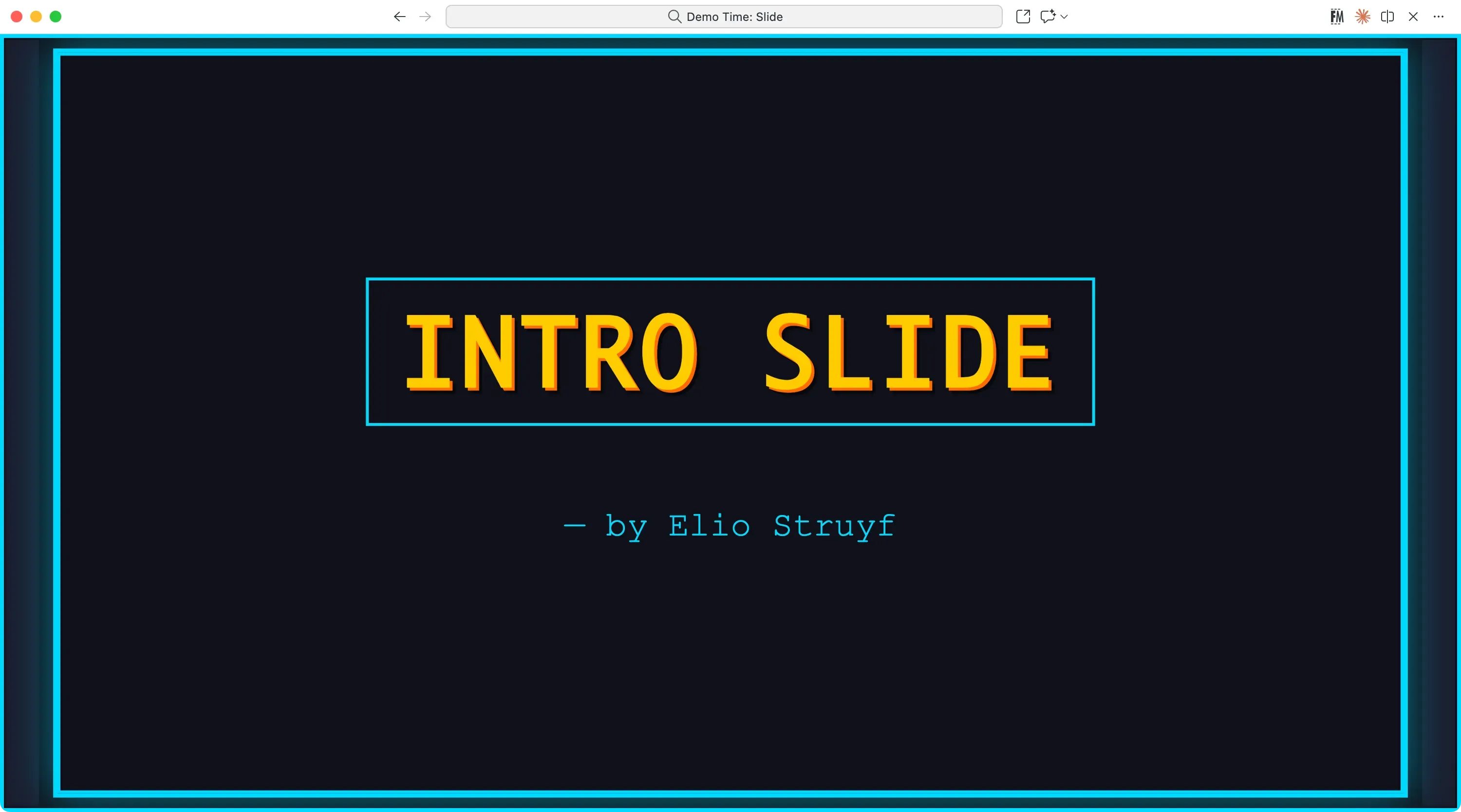
/* Intro layout */--demotime-intro-background: var(--demotime-darker);--demotime-intro-color: var(--demotime-text);--demotime-intro-heading-color: var(--demotime-secondary);--demotime-intro-heading-background: transparent;
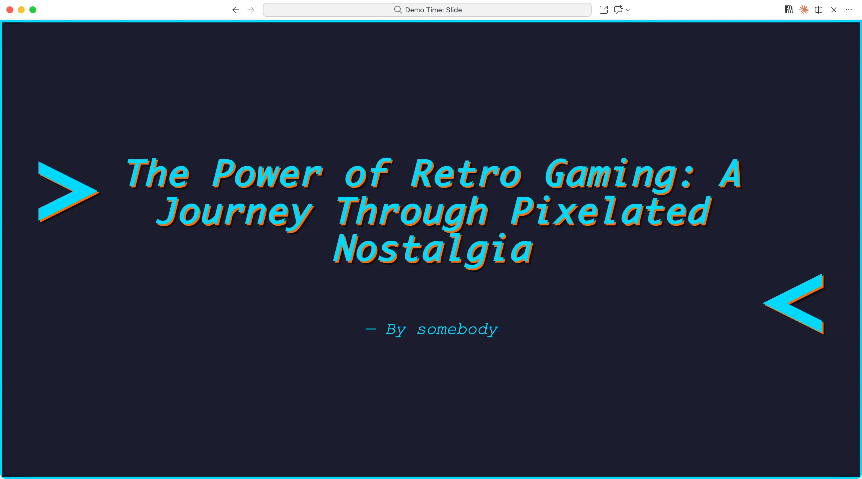
/* Quote layout */--demotime-quote-background: var(--demotime-dark);--demotime-quote-color: var(--demotime-text);--demotime-quote-heading-color: var(--demotime-primary);--demotime-quote-heading-background: transparent;
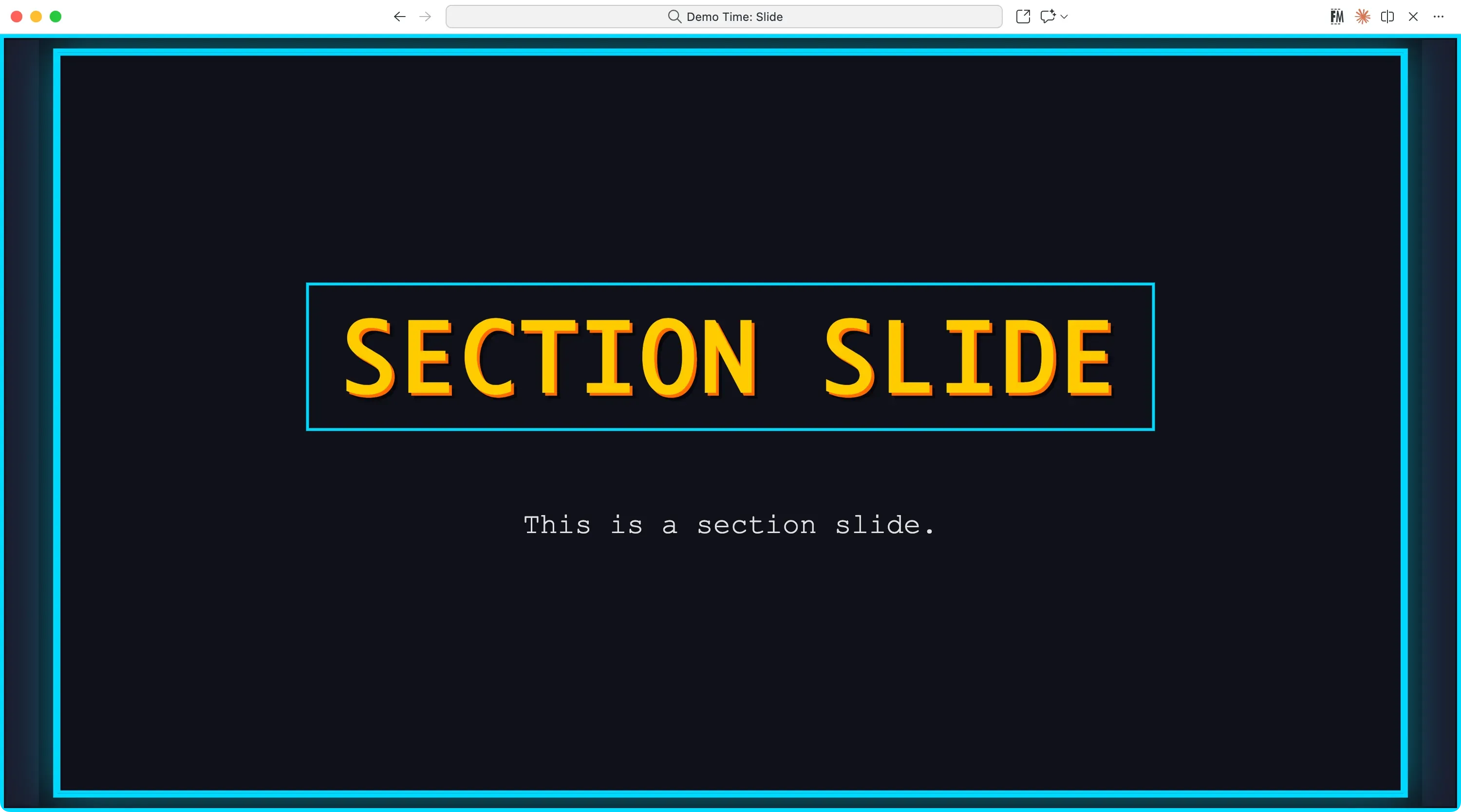
/* Section layout */--demotime-section-background: var(--demotime-darker);--demotime-section-color: var(--demotime-text);--demotime-section-heading-color: var(--demotime-secondary);--demotime-section-heading-background: transparent;
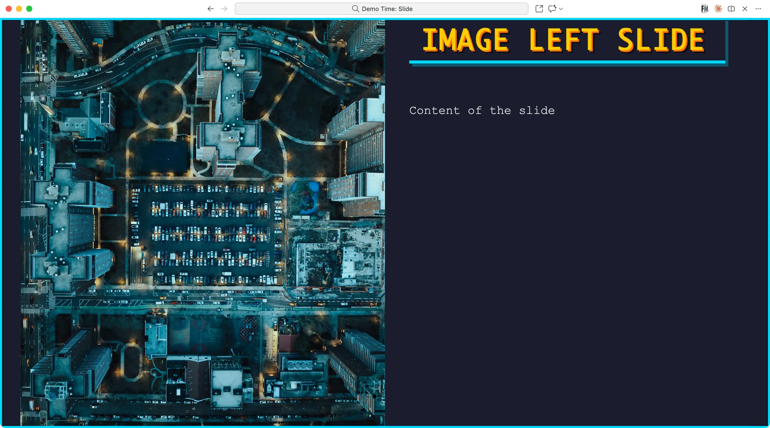
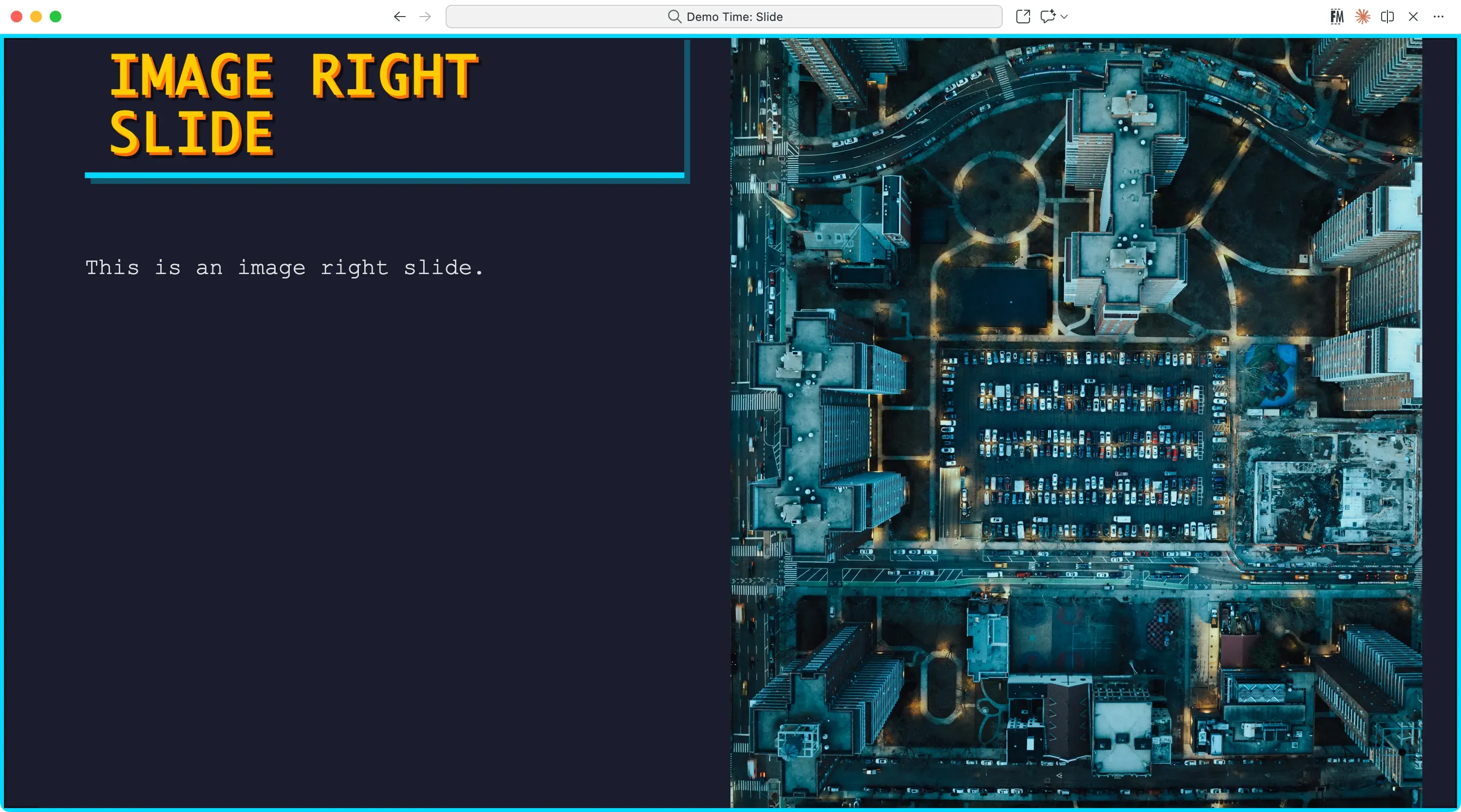
/* Image layouts */--demotime-image-heading-background: rgba(26, 29, 46, 0.95);
--demotime-image-left-background: var(--demotime-background);--demotime-image-left-color: var(--demotime-color);--demotime-image-left-heading-color: var(--demotime-secondary);--demotime-image-left-heading-background: transparent;
--demotime-image-right-background: var(--demotime-background);--demotime-image-right-color: var(--demotime-color);--demotime-image-right-heading-color: var(--demotime-secondary);--demotime-image-right-heading-background: transparent;
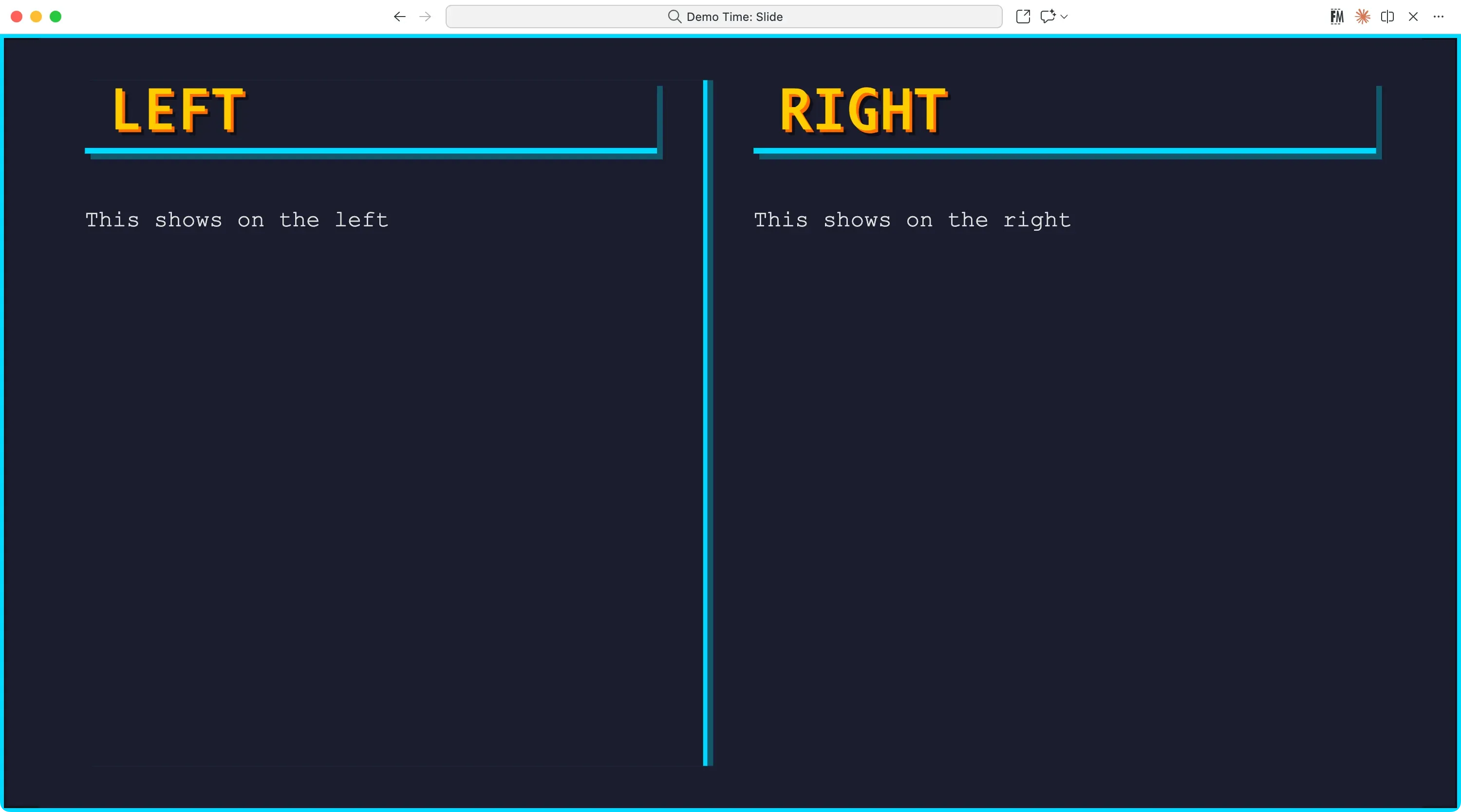
/* Two columns layout */--demotime-two-columns-background: var(--demotime-background);--demotime-two-columns-color: var(--demotime-color);--demotime-two-columns-heading-color: var(--demotime-secondary);--demotime-two-columns-heading-background: transparent;Typography
The theme uses a system monospace font stack for maximum compatibility:
font-family: 'Consolas', 'Monaco', 'Courier New', monospace;All headings feature:
- Uppercase text transformation
- Layered text shadows (accent color + black shadow)
- Increased letter spacing (0.05em)
- Bold weight (700)
Visual Effects
Borders
- 4px cyan border around entire slide
- Inset 2px darker border for depth
- Glowing box-shadow effect:
0 0 20px rgba(0, 217, 255, 0.3)
Text Shadows
All headings include a distinctive layered shadow effect:
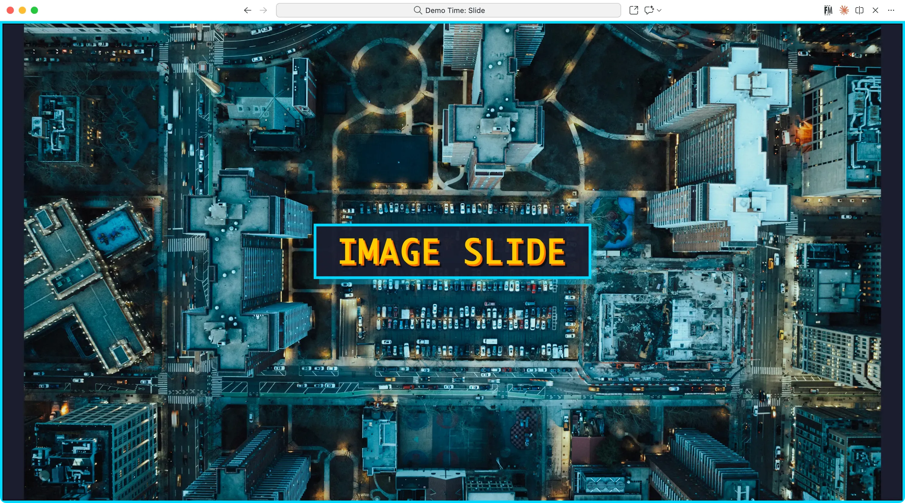
text-shadow: 2px 2px 0 var(--demotime-accent), 4px 4px 0 rgba(0, 0, 0, 0.5);Images
Images are rendered with pixelation for authentic retro feel:
image-rendering: pixelated;List Markers
- Unordered lists use triangle bullets:
▶ - Ordered lists use pixelated counter styling
Layout-Specific Styling
Intro & Section Layouts
Both feature double-border effects with glowing cyan borders and centered content.
Quote Layout
Styled with italic text and decorative > and < brackets positioned around the main heading.
Two Columns Layout
Features a vertical cyan border separator with shadow effect between columns.
Color Palette
| Purpose | Color | Hex |
|---|---|---|
| Primary (Cyan) | Links, borders, accents | #00d9ff |
| Secondary (Yellow) | Headings | #ffcc00 |
| Accent (Orange) | Hover states, shadows | #ff6b00 |
| Background | Main slide background | #1a1d2e |
| Darker Background | Intro/section layouts | #0f1119 |
| Text | Body text | #e0e0e0 |
Best Use Cases
The Pixels theme is perfect for:
- Retro gaming presentations
- Hackathon demos
- Tech conference talks with a nostalgic twist
- Developer meetups
- Any presentation where you want to evoke 80s/90s computing nostalgia